

 .
.
Script for directors commentary
Hello, im kirk kemp, writer and director of Sugar n spice.
Im just going to talk you through the opening sequence of sugar n spice, but before i do heres a little more information about my production company and some other information relating to it.....
My production company was created in order to show and promote my video productions and work.
When i was looking for distribution companies i came across Dog Woof: indie, and i think they will be the best company to distribute my film, as they focus mainly on distributing british independent films, and as you can see that is what sugar n spice is.
To make the full length version of this film, i would most likely ask for funding from the uk-film council, as they fund many british independent films.
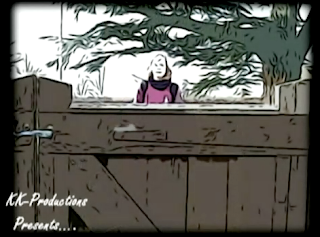
As you can see at the start of the film opening i have placed the title of my production company. i have done this mainly due to copy right and also to show that it’s my production company that has produced this film.
also this follows in the footsteps of a traditional film opening.
As the titles appear they appear within the negative space, which is black. I chose to do it this way as the titles seem a lot more clear and easy to understand.
As you will see the titles continue to appear in the same way but at different points around the screen.
I went with this idea as i believe it keeps the audience fixed both on the action and the titles which i believe are very important within a film opening.
Realistically speaking the films that would be released in a similar way to mine are any independent uk films, for example the film *Life is sweet*.
It’s a great example of a great british film, which is actually closely related to sugar n spice.
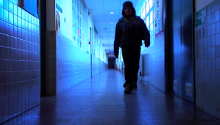
As you can see it is quite obvious from the first few shots, mainly due to the school uniform, that sugar n spice is aimed at teenagers.
And the overall age group for this film is 15 upwards this is due to the content within the film.
Such as... swearing..., and some scenes of violence...
The order of the 9 shots, from the top left corner (1) to the bottom right hand corner (9), are as follows:
(1) Costumes/props (2) Lighting (3) Settings - time etc (4) Framing (5) Camera movement (6) Transitions (7) Visual effects (8) Typography (9) Narrative
Shot one: Costume / props
As you can see, i have chosen this shot, as it shows clearly that the costume for this film opening is a school uniform. Also it shows one of the main props which is the school bag, which is shown later on in the film opening.
Shot two: Lighting
I have chosen this shot, as it shows that the first few scenes are shot outside, which shows that i have used *natural lighting* from the sun, which makes the shot alot more clear.
Shot three: Settings - time etc
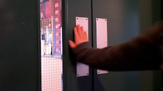
I have chosen this shot, as it shows the scene is about to change from outside to inside, this is a great close up which i believe shows that the character is just about to change location, so it prepares the audience for a location change, and i believe this shot shows the setting / time change within the scene.
Shot four : Framing
Ive chosen this shot, as it shows that the shot is framed by the door, so the audience willl expect to see the actor walk through the door, into centre shot. Also the door supplies a brilliant frame for the camera, and ensures that the subject (actor) is in the centre of the screen, and not off centre.
Shot five: Camera movement
Or tho my film opening is done in stopmotion there is still some aspects of camera movement. For exmaple within this shot the door is closed, and as it is pulled closed the camera photo slightly moves position, which suggest's the camera has moved, slightly, this keeps the action more live, and also keeps the audience fixed on what is happening and gives them a slight change to the norm, of what has already happend within the sequence.
Shot six: Transitions
Within my sequence, between all 35-40 shots, there is a slight fade transition, this makes the action seem alot less jumpy, and means the action seems to flow a lot more smoothly compared without the tranisition, where the frames seem to jump. I have chosen this frame as it shows the slight colour diffrence compared with the past shots, this is because it is captured in between the fade effect / tranisiton.
Shot seven: Visual effects
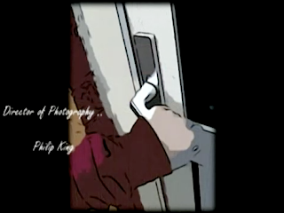
As you can see the whole sequence, is in stop motion, and the photos have been "cartoonized" and slightly made sharper. This is, in my opinion and from my feedback, a very good effect, which is not usually seen in many films. I chose this shot as it shows one of the best cartoonized photos, or so i believe.
Shot eight: Typography
I went with the handwritten style font, as i believe it fits in very well with the whole theme for the movie which is young college / school lad. Also it is visually very good, and works well with the cartoon effect. (hand drawn / hand written). I have chosen this shot as it shows the black negative space, in hwich the titles appear, or tho it doesnt show the actual titles it shows the area in which the titles appear. (You can see the titles on the other shots) --- 1-7 and 9.
Shot nine: Narrative
The opening sequence, shows the opening to the film, and in my mind shows the audience what the film is about, but does not show it in full, which leaves the audience wanting to watch on. The idea was to show a college boy arriving home from school and cooking some things, but as this was too long, i cut it down to just 2minutues. Within these 2mins i believe that it shows the college boy arriving home from school and walking into the kitchen, and in my mind this is enough, in order or the audience to get a basic feel for the film and also makes them want to watch on.
I have chosen this shot as it shows the final scene in my opening sequence, and after the title fades / flashes away / out. The transition will be to the cartoon photo once again, but from this it will fade once again, but will fade into real / live action, which will be easy to achieve as its all donw with pictures etc.


Shown below is a screen grab from Jims webpage, showing a brief descirption of what Jim has done and also showing some of his videos.


